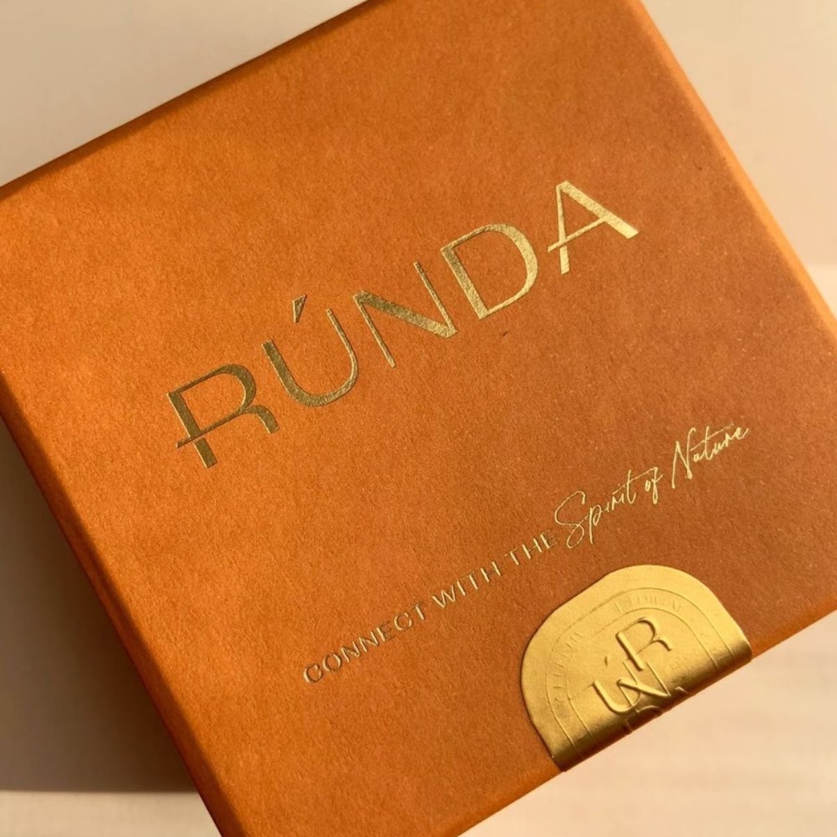
Fine typography and delicate linework can make luxury packaging look refined, but they can also be challenging to reproduce consistently with foil stamping. When evaluating the minimum line width and minimum font size for foil stamping, we have found that line width or font size alone cannot determine whether fine details can be reproduced reliably.
We have encountered packaging projects where customers supplied artwork containing extremely thin foil lines, as well as cosmetic packaging designs where very small text needed to be reproduced in metallic foil. Based on our production testing and experience, lines around 0.25 pt (approximately 0.09 mm) and text around 4–5 pt are already within a highly demanding range.
Rather than treating these figures as universal manufacturing limits, we evaluate the artwork, font structure, foil die, substrate and production conditions together. When necessary, we make small artwork adjustments, optimize the foil die specification and conduct physical testing before mass production.
Quick Answer: There is no universal minimum line width for foil stamping or minimum font size for foil stamping that applies to every project. Based on our production testing and experience, lines around 0.25 pt (approximately 0.09 mm) and text around 4–5 pt are already within a highly demanding range. Actual feasibility depends on the artwork, font structure, foil die, substrate and production conditions.
Case Study at a Glance
| Item | Our Production Experience |
|---|---|
| Main Challenge | Extremely fine lines and small text requiring foil stamping |
| Typical Applications | Fine decorative foil patterns and small foil text on cosmetic packaging |
| Fine-Line Reference | Around 0.25 pt / approximately 0.1 mm enters a highly demanding range |
| Small-Text Reference | Around 4–5 pt, depending strongly on font and stroke structure |
| Main Variables | Artwork, line spacing, font, foil die, paper and production settings |
| Tooling Options | Aluminum or copper dies with different engraving precision and depth |
| Artwork Solution | Minor adjustment of line width, stroke weight or spacing before testing |
| Substrate Consideration | Paper thickness, smoothness, coating and compressibility can affect detail |
| Validation | Physical testing on the actual or representative production material |
| Key Lesson | Fine-detail foil stamping should be evaluated as a complete production system |
The Challenge: Fine Artwork Does Not Always Translate Directly Into Foil
A thin line or small piece of text can look perfectly sharp when viewed as vector artwork on a computer screen.
Physical foil stamping is different.
A 0.09 mm line in a design file is a mathematical vector path. During production, however, that line has to be physically reproduced through the interaction of:
Artwork → Foil Die → Foil → Heat & Pressure → Paper
The same principle applies to small typography.
A word may look perfectly clear when enlarged to 800% in Illustrator, but the foil die must reproduce every stroke, gap and enclosed space at the actual finished size.
This is why we do not evaluate fine-detail foil artwork only by asking:
“How thin is the line?”
or:
“What is the font size?”
We also examine:
- minimum stroke width,
- gaps between adjacent elements,
- enclosed spaces within letters,
- serif or sans-serif construction,
- positive and reversed details,
- surrounding foil coverage,
- paper surface,
- and the overall complexity of the design.
Two designs with the same minimum line width—or two fonts at exactly the same point size—can therefore behave very differently during foil stamping.
A Real Production Situation: Extremely Fine Foil Lines
In one packaging project, the customer’s foil artwork contained extremely thin decorative lines.
The design relied on these delicate details to create a refined appearance, so substantially increasing every line width would have changed the intended visual character.
Instead of immediately asking the customer to simplify the design, we evaluated whether the artwork could be reproduced through controlled production testing.
Based on our previous foil-stamping tests and production experience, lines around 0.25 pt, or approximately 0.09 mm, are already extremely fine for conventional foil stamping.
However, we do not treat 0.09 mm as a guaranteed universal minimum.
At this level of detail, the production window becomes narrow.
Depending on the specific combination of artwork, tooling, foil and substrate, a fine line may:
- reproduce clearly,
- transfer incompletely,
- become visually heavier,
- lose edge definition,
- or merge with nearby details.
Therefore, the more useful question is not:
“Can foil stamping produce a 0.09 mm line?”
It is:
“Can this specific 0.09 mm detail be reproduced clearly and consistently with this artwork, foil die, foil and substrate?”
That distinction becomes particularly important when moving from a successful test to repeatable mass production.
A Real Production Situation: Small Foil Text on Cosmetic Packaging
We have encountered a similar challenge with cosmetic packaging.
In these projects, small typography was designed to be foil stamped, creating a more delicate metallic appearance than the larger foil logos commonly used on premium packaging.
Based on our production experience, text around 4–5 pt should already be treated as a demanding range requiring closer artwork review and testing.
But point size alone does not determine whether the text can be reproduced successfully.
For example:
5 pt simple sans-serif text
and
5 pt high-contrast serif text
have the same nominal font size, but their thinnest strokes may be completely different.
A small serif font may contain:
- extremely thin hairlines,
- small enclosed counters,
- narrow gaps,
- closely spaced characters,
- and fine decorative terminals.
These details may be more difficult to reproduce than a heavier sans-serif typeface at exactly the same point size.
For this reason, when evaluating the minimum font size for foil stamping, we inspect the actual vector structure of the lettering rather than approving it based only on the number shown in the font-size field.
Why Fine Lines and Small Text Can Lose Definition
Foil stamping is a physical transfer process.
The foil must release from its carrier and transfer onto selected areas of the substrate under controlled heat and pressure.
As artwork becomes smaller and more intricate, the margin for production variation becomes narrower.
Fine lines may transfer incompletely.
If a line becomes extremely thin, some portions may not reproduce as consistently as larger foil areas.
Small gaps may begin to fill.
When two foil elements are positioned very close together, the visible separation between them can become less distinct.
Letter counters may lose clarity.
Small enclosed spaces inside letters such as a, e, A, B or R can become partially filled or appear smaller.
Thin strokes may appear heavier than the original artwork.
Even when the foil transfers successfully, extremely delicate strokes may not retain exactly the same visual weight as the vector file.
This is why artwork that looks technically perfect on screen is not automatically production-ready for fine foil stamping.
Why Line Width and Font Size Are Only Starting Points
The minimum line width for foil stamping and minimum font size for foil stamping are useful initial references, but neither can determine production feasibility on its own.
For thin-line artwork, the space between lines can be just as important as the lines themselves.
Imagine two patterns:
Pattern A:
0.09 mm lines with generous spacing.
Pattern B:
0.09 mm lines positioned extremely close together.
Although both use the same minimum line width, Pattern B may be considerably more difficult to reproduce cleanly because the negative spaces between the foil areas are also extremely small.
Typography follows the same principle.
A small character is made from both:
positive strokes + negative spaces
A 4–5 pt font with relatively strong strokes and open counters may therefore be easier to reproduce than another font of the same nominal size containing extremely fine strokes and tight enclosed spaces.
Successful fine-detail foil stamping depends on preserving both the foil areas and the spaces around them.
Positive and Reversed Fine Details Behave Differently
Another factor we examine is whether the fine artwork is positive or reversed.
A positive foil line is created by transferring foil onto a narrow line.
A reversed detail may involve leaving a very small non-foil gap surrounded by a larger foil area.
These two structures can create different production challenges.
For example, a very small reversed letter inside a large foil block may risk losing its internal negative space even if a positive letter of similar dimensions can be reproduced.
The same applies to intricate patterns where thin unfoiled lines separate larger metallic areas.
This is another reason why minimum line width and minimum font size should not be interpreted as universal guarantees.
The geometry of the artwork itself matters.
We Can Make Small Artwork Adjustments Before Testing
One of the most effective solutions is sometimes not a major change in the production process.
It is a very small change to the artwork.
If a line sits too close to the practical production range, we may slightly increase its width before testing.
For small typography, selected adjustments may include:
- slightly increasing very thin strokes,
- opening extremely small counters,
- increasing spacing between certain characters,
- increasing gaps between adjacent foil elements,
- or simplifying details that are unlikely to remain visible at actual size.
The objective is not to visibly redesign the customer’s branding.
The principle is:
Make the smallest production-oriented adjustment necessary while preserving the original visual intent.
A typical workflow may therefore be:
Original Artwork → Production Review → Minor Adjustment → Foil Test → Evaluation → Final Artwork
For example, if the original design contains several extremely fine line weights, we may prepare slightly adjusted versions for testing rather than making a large change immediately.
The physical results can then be compared before the final production artwork is confirmed.
The Foil Die Can Also Be Optimized for Fine Detail
Artwork is only one part of the equation.
The foil-stamping die also affects how fine lines and small typography are reproduced.
Depending on the artwork and production requirements, different die materials and engraving specifications can be considered.
Aluminum Foil Dies
Aluminum dies are used for many foil-stamping applications and can provide a practical balance between tooling requirements and cost.
Depending on the artwork, they can also reproduce fine details successfully.
However, when a design becomes particularly demanding, we evaluate whether the tooling specification is appropriate for the required precision and production run.
Copper Foil Dies
Copper dies may be considered for projects requiring a different balance of detail reproduction, durability and tooling characteristics.
This does not mean:
Copper die = always better
or:
Aluminum die = only suitable for simple artwork.
The appropriate choice depends on the actual project.
For fine-detail foil stamping, we may evaluate:
- die material,
- engraving precision,
- engraving depth,
- relief profile,
- line spacing,
- negative spaces,
- substrate,
- and expected production quantity.
Therefore, when fine foil artwork does not reproduce as expected, changing the customer’s design is not always the first or only solution.
The tooling specification itself may also be optimized.
Why Foil Die Depth and Precision Matter
Different artwork creates different requirements for the foil die.
A large solid foil logo and an intricate pattern containing extremely thin lines do not necessarily benefit from exactly the same die characteristics.
For fine-detail artwork, the tooling needs to maintain clear separation between:
- foil and non-foil areas,
- adjacent fine lines,
- small character counters,
- and narrow negative spaces.
Engraving depth, precision and profile can therefore become part of the engineering decision.
This is also why we prefer to receive the customer’s original vector artwork whenever possible.
A screenshot or low-resolution raster image may show the general design, but it does not allow the production team to inspect and adjust individual paths with the same precision.
Paper Thickness Can Affect Foil Definition
Another important variable is the substrate.
The same foil artwork and similar production settings do not necessarily produce exactly the same level of detail on every paper.
In our production experience, thin coated paper and thicker coated paper can reproduce fine foil details differently.
However, GSM or paper thickness should not be considered in isolation.
Other characteristics also matter:
- surface smoothness,
- coating structure,
- paper stiffness,
- compressibility,
- surface texture,
- and response to stamping pressure.
A thicker coated paper can respond differently under stamping pressure from a thinner coated sheet.
Similarly, a heavily textured paper creates a different transfer condition from a smooth coated paper even when their nominal grammage is similar.
Therefore:
A successful fine-detail foil test on one paper does not automatically guarantee the same result on another substrate.
When the artwork is close to the practical production range, we prefer to test it on the actual production material or a representative equivalent.
Why the Same Artwork Can Produce Different Results on Different Papers
Consider the following simplified example:
| Variable | Project A | Project B |
|---|---|---|
| Artwork | Same fine foil pattern | Same fine foil pattern |
| Minimum Line | Same | Same |
| Paper | Thin, smooth coated paper | Thick coated paper |
| Surface Response | One pressure behavior | Different pressure behavior |
| Fine-Detail Result | May be sharper under one setup | May require different optimization |
This does not mean thin paper is always better for fine foil stamping.
Nor does it mean thicker paper is always worse.
The important point is that the substrate changes the production condition.
Tooling and stamping settings therefore need to be matched to the actual material rather than assuming that one setup will behave identically across different papers.
Fine Detail on Screen vs Fine Detail on the Finished Package
Design software makes it extremely easy to zoom into artwork.
At 1000% magnification, even a 0.09 mm line or 4 pt character can look substantial.
The finished package is not viewed at 1000%.
We therefore recommend evaluating fine foil artwork at:
100% actual size
before finalizing the design.
Ask:
- Is the small text actually readable at normal viewing distance?
- Does the fine line contribute to the design when viewed at real size?
- Are the smallest gaps visually necessary?
- Would a very small increase in stroke width be noticeable?
- Could slightly opening a character counter improve production without changing the design?
- Is the detail important enough to justify additional tooling or sampling?
Sometimes a technically demanding feature provides almost no visible benefit on the finished package.
In other cases, delicate typography or linework is central to the brand identity and deserves additional production optimization.
The decision should therefore combine design intent and manufacturing feasibility.
Why Physical Foil Testing Matters
Digital mockups can show where foil is intended to appear.
They cannot accurately simulate how extremely fine lines or small typography will interact with:
- the actual foil,
- die geometry,
- paper surface,
- pressure,
- temperature,
- and production equipment.
This becomes particularly important when the artwork approaches the practical production range.
A physical test allows us to evaluate:
- whether thin lines transfer completely,
- whether small gaps remain open,
- whether 4–5 pt text remains legible,
- whether letter counters remain clear,
- whether edges retain sufficient definition,
- whether the paper surface supports the required detail,
- and whether the result can reasonably be repeated in mass production.
For fine-detail foil work, sampling is therefore not only about approving appearance.
It is also a form of production validation.
Fine-Detail Foil Stamping Is a System, Not a Single Number
One of the most important lessons from these projects is that the minimum line width and minimum font size should not be treated as isolated specifications.
A more useful model is:
Artwork + Foil Die + Foil + Substrate + Production Settings = Final Detail Reproduction
Consider two projects that both contain a 0.09 mm line.
Project A
Smooth coated paper
- isolated positive lines
- sufficient spacing
- optimized tooling
Project B
Textured paper
- dense foil coverage
- narrow reversed gaps
- highly intricate typography
Both technically contain the same minimum line width, but their production difficulty can be completely different.
The same principle applies to two pieces of 5 pt text with different typefaces.
This is why we avoid blanket statements such as:
“Our minimum foil line is always 0.09 mm.”
or:
“We can always foil stamp 4 pt text.”
Instead, based on our production testing and experience, we treat approximately 0.25 pt / 0.09 mm fine lines and 4–5 pt small typography as reference points where closer engineering review and physical testing become especially important.
How We Evaluate Fine Foil Artwork Before Production
| Check | What We Evaluate |
|---|---|
| Minimum Line Width | Whether very fine positive lines can transfer reliably |
| Minimum Font Size | Initial reference for very small typography |
| Actual Stroke Width | Whether individual character strokes become too fine |
| Minimum Gaps | Risk of nearby foil areas merging |
| Letter Counters | Whether small enclosed spaces remain clear |
| Font Structure | Serif, sans serif, stroke contrast and decorative details |
| Positive / Reversed Artwork | Different risks for foil and non-foil details |
| Foil Coverage | Interaction between fine details and surrounding foil areas |
| Paper Thickness | How the substrate responds to stamping pressure |
| Paper Surface | Smoothness, texture and coating |
| Foil Die | Material, engraving precision, depth and profile |
| Physical Sample | Whether the result is sufficiently stable before mass production |
What Designers Should Provide for Fine-Detail Foil Stamping
For artwork containing very small foil elements, we recommend supplying the original vector production file whenever possible.
Useful information includes:
- AI or vector PDF artwork,
- fonts converted to outlines,
- foil artwork on a separate layer,
- artwork shown at actual 100% size,
- packaging dimensions,
- intended paper or substrate,
- foil color,
- foil position,
- quantity,
- and reference images showing the intended appearance.
The foil layer should clearly identify the areas that will physically receive foil.
Do not judge fine-detail feasibility only from a zoomed screenshot.
For broader production and artwork requirements, see our Foil Stamping guide.
What We Learned From These Projects
The main lesson is not that every foil line must be wider than a particular number or every font must be larger than a particular point size.
It is that fine-detail foil stamping needs to be engineered rather than assumed.
When the artwork approaches the practical production range, there are several variables we can evaluate before making a major visual compromise.
1. Review the actual vector artwork.
Do not judge only by the nominal font size, line width or a screenshot.
2. Check fine lines and small text separately.
A thin decorative line and a small character present related but different production challenges.
3. Check positive details and negative spaces together.
Line width matters, but so do gaps, counters and reversed elements.
4. Make small artwork adjustments when necessary.
A subtle increase in stroke width or spacing may significantly improve production stability.
5. Evaluate the foil die.
Material, engraving precision, depth and profile can affect fine-detail reproduction.
6. Consider the actual paper.
Thickness, smoothness, coating and compressibility influence how the foil transfers.
7. Conduct a physical test when the detail is critical.
The goal is not simply to produce one successful sample. It is to determine whether the design can be reproduced clearly and consistently in production.
A packaging supplier should therefore do more than answer:
“Yes, we can do foil stamping.”
The more useful question is:
“How can we reproduce this specific foil design clearly and consistently in mass production?”
Frequently Asked Questions About Fine-Detail Foil Stamping
What is the minimum line width for foil stamping?
There is no universal minimum line width that applies to every foil-stamping project. Based on our production testing and experience, approximately 0.25 pt / 0.09 mm is already an extremely fine range requiring careful evaluation. Actual feasibility depends on the artwork, foil die, foil, substrate and production conditions.
What is the minimum font size for foil stamping?
There is also no universal minimum font size. Based on our production experience, text around 4–5 pt should be treated as a demanding range requiring closer artwork review and testing. Font construction and actual stroke width can matter more than nominal point size alone.
Can foil stamping reproduce 0.1 mm lines?
We have tested foil details around 0.09–0.1 mm, but we do not treat this as a guaranteed universal capability. At this scale, small changes in artwork geometry, tooling and substrate can significantly affect the result, so physical testing is recommended.
Can 4 pt or 5 pt text be foil stamped?
It may be possible depending on the font, stroke thickness, spacing, substrate, foil die and production conditions. A simple 5 pt sans-serif font can behave very differently from an intricate 5 pt serif font. We therefore review the actual vector artwork before confirming feasibility.
Why do very fine foil lines disappear or become unclear?
Extremely thin lines operate within a narrow production window. Incomplete foil transfer, substrate characteristics, tooling and closely spaced artwork can all affect their definition.
Why does small foil-stamped text fill in?
Small gaps and enclosed spaces can lose definition when typography becomes extremely fine. Font structure, foil coverage, die geometry, substrate and production settings can all contribute.
Can fine lines or small text be adjusted before foil stamping?
Yes. Small production-oriented adjustments to line width, stroke weight, counters or spacing can improve reproducibility while keeping the original design visually almost unchanged. Critical adjustments should be confirmed through testing.
Is a copper die better than an aluminum die for fine foil stamping?
Not universally. Copper and aluminum dies have different tooling characteristics, but die material is only one variable. Artwork complexity, engraving precision and depth, substrate, production quantity and required result should all be considered.
Does paper thickness affect fine-detail foil stamping?
Yes, it can. In our production experience, thin and thick coated papers can reproduce the same fine foil artwork differently. Surface smoothness, coating structure, stiffness and compressibility also influence the result.
Should fine foil artwork be physically sampled before mass production?
When important lines or typography are close to the practical production range, we strongly recommend physical testing. It allows the artwork, foil die, foil and actual substrate to be evaluated together before mass production.
Developing Packaging With Fine Foil Details?
Fine typography and delicate linework do not necessarily need to be removed simply because they are difficult to manufacture.
The first step is to understand which part of the production system is limiting the result.
Sometimes a small artwork adjustment is enough.
In other projects, the foil die specification needs to be optimized.
And in some cases, the paper itself changes how much detail can be reproduced.
By reviewing the artwork, tooling and substrate together, we can determine the most practical way to preserve the design while improving production reliability.
Learn more about Foil Stamping and our complete Packaging Finishes Guide.
If your packaging design contains very small foil text, thin lines or intricate patterns, contact us with your artwork, packaging dimensions, material and quantity. We can review the design before production and advise whether artwork optimization, tooling adjustments or physical testing may be required.